
Creating responsive email templates is essential for effective email marketing. Email frameworks simplify the development process by ensuring compatibility across devices and email clients. Below are the top 10 best responsive email frameworks for 2025, each offering unique features to help you build high-quality email campaigns.
1. Foundation for Emails
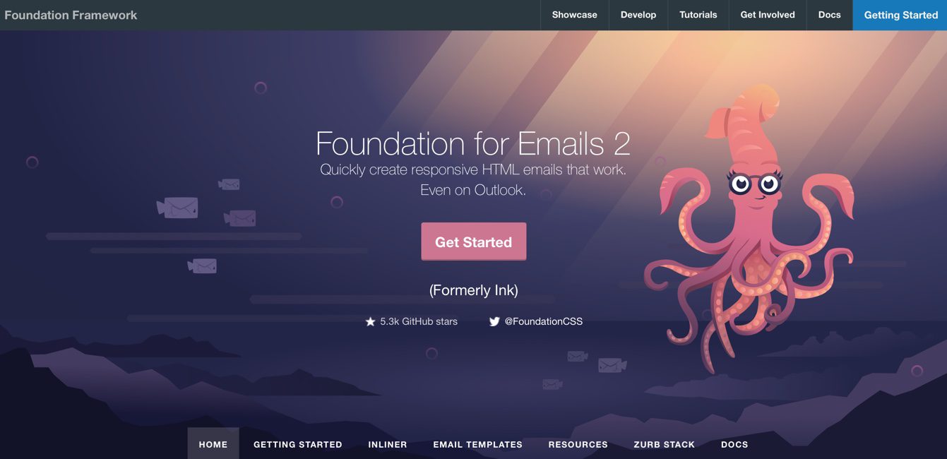
Foundation for Emails (formerly Ink) by Zurb is a powerful framework designed for building responsive emails. It features a flexible grid system, Sass integration, and a robust set of UI components. Its Inky templating language simplifies HTML structure, making email coding efficient and scalable. Features include:
- Mobile-First Approach: Designed for seamless mobile experience
- Inky Templating Language: Simplifies coding for faster email creation
- Prebuilt Templates: Speeds up development with ready-made designs
- Inline CSS Support: Ensures better compatibility with email clients
- Cross-Client Compatibility: Works smoothly across Outlook, Gmail, Yahoo, and Apple Mail
Example code:
<container>
  <row>
    <columns>
      <h1>Welcome to Foundation for Emails</h1>
      <p>This is a responsive email template using Inky syntax.</p>
    </columns>
  </row>
</container>
2. MJML
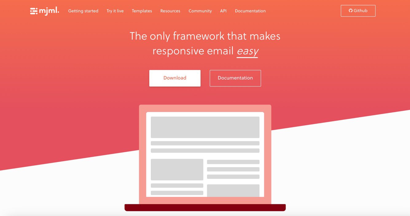
MJML is an open-source email framework that simplifies responsive email creation with its easy-to-use syntax. It automatically generates responsive HTML, ensuring consistent rendering across email clients. Features include:
- Component-Based Structure: Enables easy reuse of elements for rapid development
- Automatic Media Queries: Adjusts design for different screen sizes
- Clean and Concise Syntax: Reduces coding complexity
- Live Rendering Engine: Instantly previews changes in real-time
- Seamless Integration: Works well with Mailchimp, HubSpot, and other email platforms
Example Code:
<mjml>
  <mj-head>
    <mj-preview>Preview Text</mj-preview>
  </mj-head>
  <mj-body>
    <mj-section>
      <mj-column>
        <mj-text>Hello, this is MJML!</mj-text>
      </mj-column>
    </mj-section>
  </mj-body>
</mjml>
3. Bootstrap Email
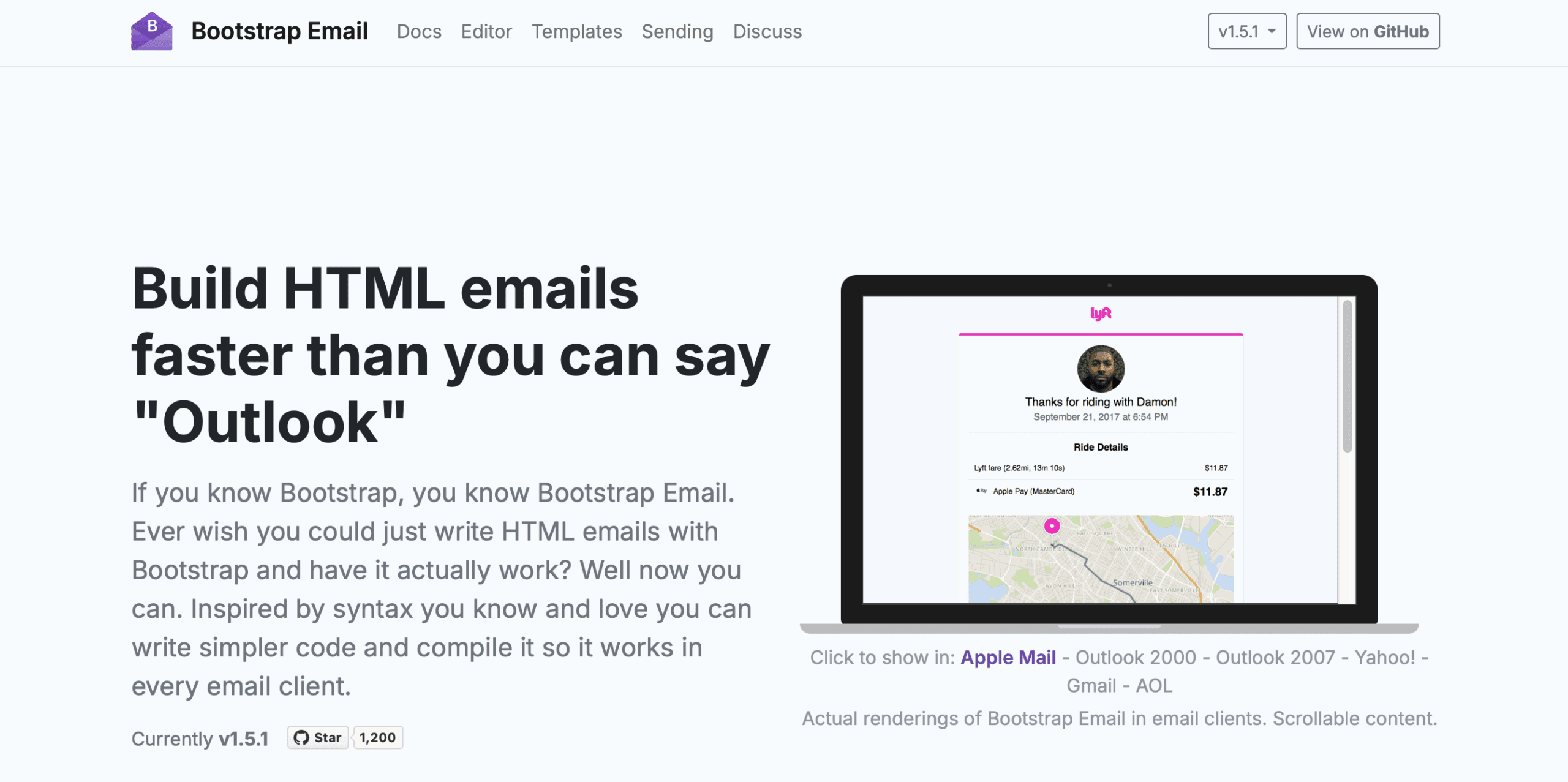
Bootstrap Email brings the power of Bootstrap to email design, offering a familiar grid system and predefined components. It ensures emails look great across all devices while maintaining a lightweight structure. Features include:
- Bootstrap Grid System: Provides structured layouts for precise control
- Predefined Classes: Enables faster styling and consistency
- Cross-Client Compatibility: Optimized for major email platforms
- Inline CSS Conversion: Automatically applies styles inline for better rendering
- Easy Customization: Supports custom styling and modifications
Example Code:
<table class="container">
  <tr>
    <td class="row">
      <table class="column">
        <tr>
          <td>
            <h1>Welcome to Bootstrap Email</h1>
          </td>
        </tr>
      </table>
    </td>
  </tr>
</table>
4. Maizzle
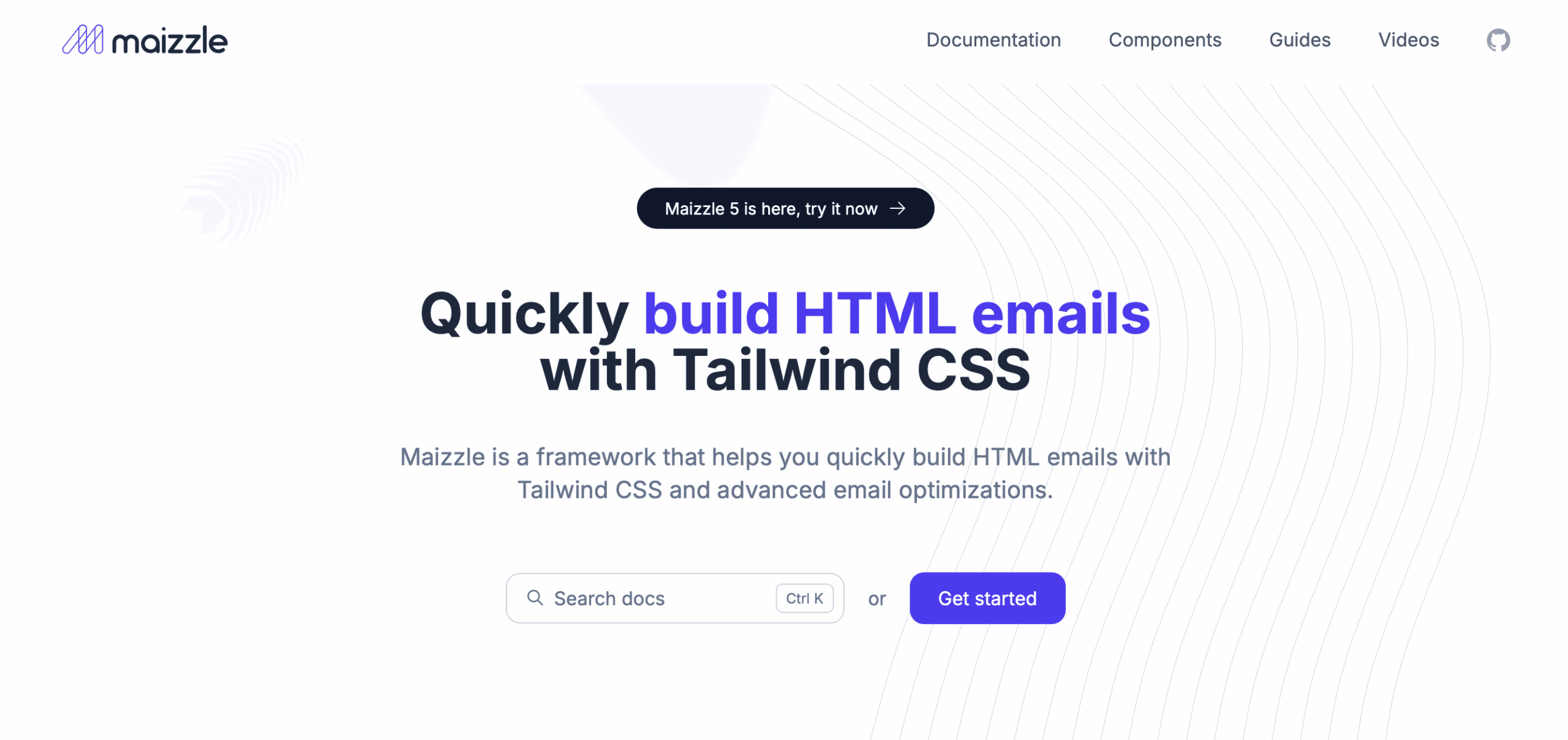
Maizzle is a modern email framework built with Tailwind CSS. It allows developers to create highly customized and responsive email templates with a utility-first approach. Features include:
- Tailwind CSS Integration: Leverages utility-first styling for speed
- Customizable Templates: Provides prebuilt email templates for quick implementation
- Workflow Automation: Supports modern development pipelines
- Email Client Optimization: Ensures consistent rendering across platforms
- Live Previews: Allows real-time testing and debugging
Example Code:
<div class="bg-gray-100 p-4">
  <h1 class="text-lg font-bold">Welcome to Maizzle</h1>
  <p>This email uses Tailwind CSS for styling.</p>
</div>
5. EmailFrameWork
EmailFramework is a powerful solution for creating responsive, mobile-friendly email templates. It simplifies email development with clean HTML/CSS, ensuring cross-client compatibility. Featuring prebuilt layouts, easy customization, and optimized rendering, EmailFramework helps businesses craft professional emails that look great on any device. Boost your email marketing with fast, flexible, and reliable templates using EmailFramework. Features include:
- Modular Design: Enables reusability of components
- Prebuilt Grid System: Simplifies layout structure
- Lightweight Code: Reduces load times and improves email performance
- Compatibility Testing: Ensures seamless viewing across email clients
- Highly Customizable: Adapts to unique branding requirements
Example Code:
<section style="padding: 20px;">
  <h1>Email Framework</h1>
  <p>Building responsive emails made easy.</p>
</section>
6. Cerberus
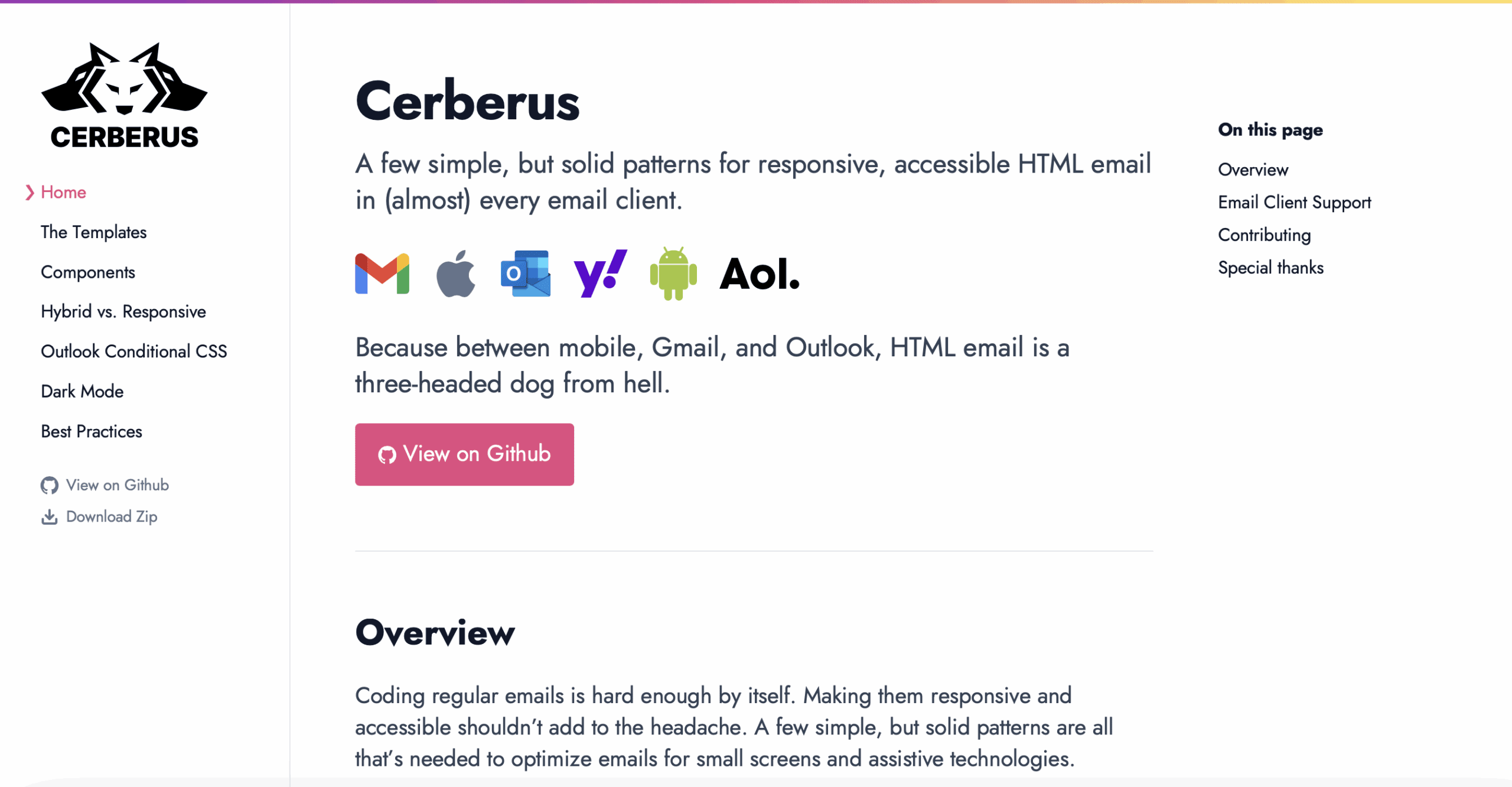
Cerberus is a simple and reliable framework that provides a set of email patterns for responsive design. It focuses on email compatibility and accessibility, ensuring robust email layouts. Features include:
- Hybrid and Fluid Layouts: Provides flexible email structures
- HTML & CSS Boilerplates: Reduces development time
- Cross-Client Support: Works efficiently across different platforms
- Optimized for Readability: Maintains clear typography and spacing
- Lightweight and Fast: Keeps emails loading quickly
Example Code:
<table>
  <tr>
    <td style="width: 100%; max-width: 600px;">
      <h1>Welcome to Cerberus</h1>
      <p>This is a responsive email template.</p>
    </td>
  </tr>
</table>
7. Mosaico
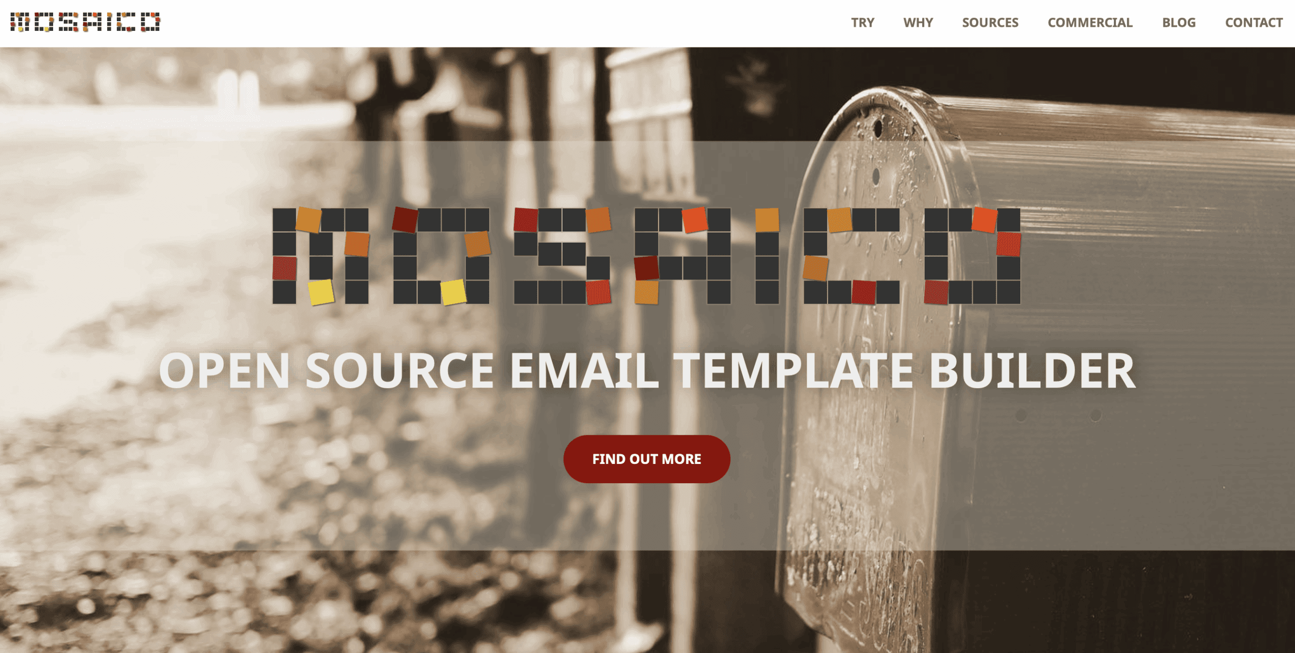
Mosaico is a free, open-source email template builder designed for responsive and customizable email campaigns. With a drag-and-drop editor, it allows users to create mobile-friendly emails effortlessly. Mosaico offers modular templates, ensuring consistency and flexibility. Its user-friendly interface, real-time preview, and HTML export make it ideal for marketers looking for a simple yet powerful email design tool. Features include:
- Live Drag-and-Drop Editing: Allows quick and easy template customization
- Open-Source and Free: No licensing costs
- Prebuilt Components: Provides ready-to-use elements
- Flexible Design Options: Supports branding and custom layouts
- Integration with Email Services: Works with major email marketing platforms
Example Code:
<table width="100%" cellpadding="0" cellspacing="0" border="0">
  <tr>
    <td align="center">
      <table width="600" cellpadding="0" cellspacing="0" border="0">
        <tr>
          <td align="center" style="padding: 20px; background-color: #f4f4f4;">
            <h1>Welcome to Mosaico</h1>
            <p>This is a responsive email template created using Mosaico.</p>
          </td>
        </tr>
      </table>
    </td>
  </tr>
</table>
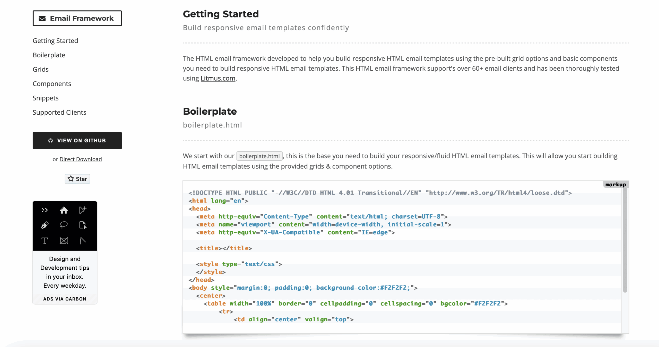
8. HTML Email Boilerplate
HTML Email Boilerplate provides a solid foundation for responsive email development. It includes best practices and reusable templates, making it easier to create cross-client compatible emails. Features include:
- Basic Responsive Framework: Ensures compatibility with multiple devices
- Cross-Platform Compatibility: Works well across email clients
- Inline CSS Support: Helps with email client consistency
- Lightweight Structure: Minimizes email size for better performance
- Easy Customization: Adapts to different branding needs
Example Code:
<!DOCTYPE html>
<html>
<head>
<meta charset="UTF-8">
<meta name="viewport" content="width=device-width, initial-scale=1.0">
<title>Email Boilerplate</title>
<style>
body {
margin: 0;
padding: 0;
background-color: #f4f4f4;
}
table {
border-spacing: 0;
}
td {
padding: 0;
}
img {
border: 0;
}
.wrapper {
width: 100%;
table-layout: fixed;
background-color: #f4f4f4;
padding-bottom: 40px;
}
.main {
background-color: #ffffff;
width: 100%;
max-width: 600px;
margin: 0 auto;
border-radius: 10px;
overflow: hidden;
}
.content {
padding: 20px;
}
</style>
</head>
<body>
<center class="wrapper">
<table class="main" width="100%" cellspacing="0" cellpadding="0">
<tr>
<td>
<table width="100%">
<tr>
<td align="center" style="padding: 20px; background-color: #007bff; color: #ffffff;">
<h1>Welcome to Our Newsletter</h1>
</td>
</tr>
<tr>
<td class="content">
<p>Hello,</p>
<p>Thank you for subscribing to our newsletter! We look forward to keeping you updated with our latest news and offers.</p>
<p>Best Regards,</p>
<p><strong>Company Name</strong></p>
</td>
</tr>
<tr>
<td align="center" style="padding: 20px; background-color: #007bff; color: #ffffff;">
<p>© 2025 Company Name. All rights reserved.</p>
</td>
</tr>
</table>
</td>
</tr>
</table>
</center>
</body>
</html>
9. HEML
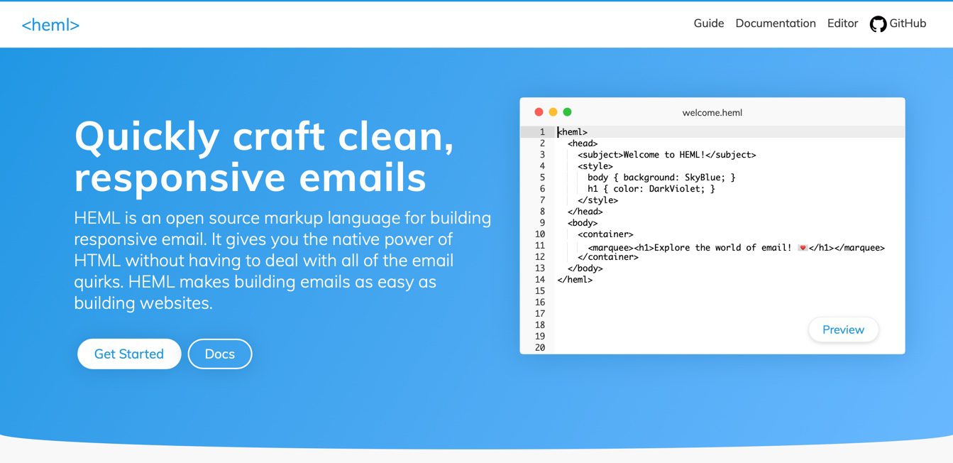
HEML is an open-source email framework that simplifies email coding with a custom markup language. It converts simple syntax into responsive, cross-client HTML emails. Features include:
- Simplified Syntax: Reduces complexity in email coding
- Automatic Responsive Design: Adjusts layout based on screen size
- Cross-Client Support: Works on all major email platforms
- Inline Style Management: Optimizes CSS for rendering
- Developer-Friendly: Provides a clean and structured coding approach
Example Code:
<!DOCTYPE html>
<html>
<head>
<meta charset="UTF-8">
<meta name="viewport" content="width=device-width, initial-scale=1.0">
<title>Email Boilerplate</title>
<style>
body {
margin: 0;
padding: 0;
background-color: #f4f4f4;
}
table {
border-spacing: 0;
}
td {
padding: 0;
}
img {
border: 0;
}
.wrapper {
width: 100%;
table-layout: fixed;
background-color: #f4f4f4;
padding-bottom: 40px;
}
.main {
background-color: #ffffff;
width: 100%;
max-width: 600px;
margin: 0 auto;
border-radius: 10px;
overflow: hidden;
}
.content {
padding: 20px;
}
</style>
</head>
<body>
<center class="wrapper">
<table class="main" width="100%" cellspacing="0" cellpadding="0">
<tr>
<td>
<table width="100%">
<tr>
<td align="center" style="padding: 20px; background-color: #007bff; color: #ffffff;">
<h1>Welcome to Our Newsletter</h1>
</td>
</tr>
<tr>
<td class="content">
<p>Hello,</p>
<p>Thank you for subscribing to our newsletter! We look forward to keeping you updated with our latest news and offers.</p>
<p>Best Regards,</p>
<p><strong>Company Name</strong></p>
</td>
</tr>
<tr>
<td align="center" style="padding: 20px; background-color: #007bff; color: #ffffff;">
<p>© 2025 Company Name. All rights reserved.</p>
</td>
</tr>
</table>
</td>
</tr>
</table>
</center>
</body>
10. Antwort
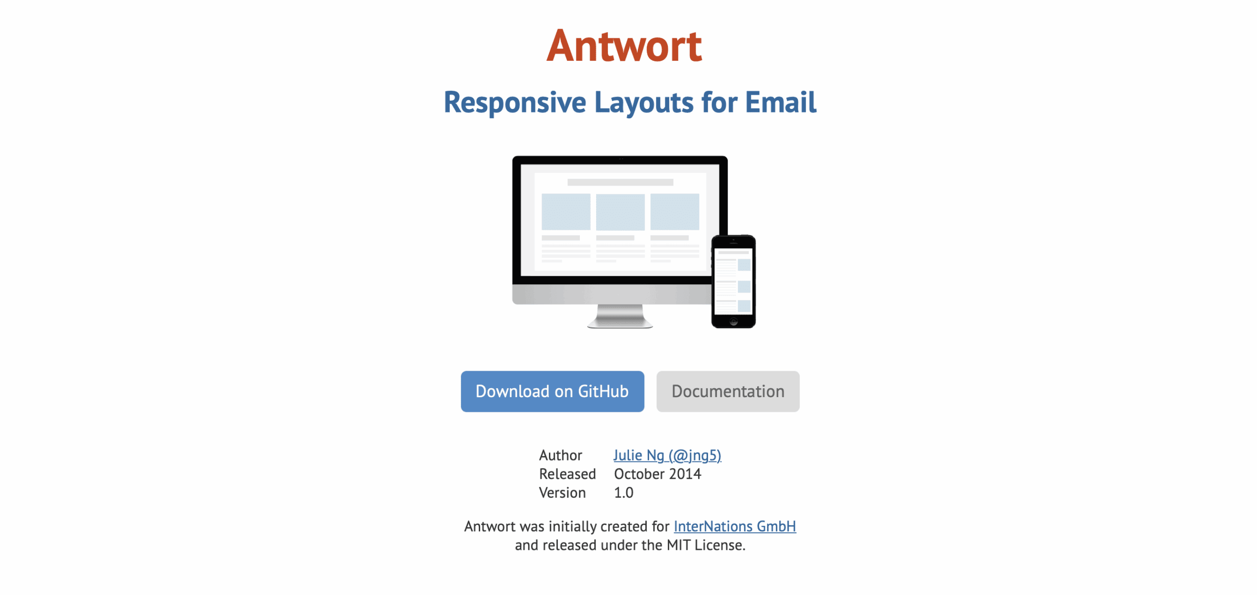
Antwort is a lightweight, responsive email framework designed for simplicity and efficiency. It offers prebuilt single-column, two-column, and fluid layouts, ensuring compatibility across major email clients without using media queries. Ideal for mobile-friendly emails, Antwort helps create clean, professional emails with minimal code. Features include:
- Prebuilt Layouts: Offers three-column, two-column, and single-column structures
- Optimized for Mobile and Desktop: Ensures responsive design
- Lightweight and Fast-Loading: Keeps emails efficient
- Simple and Clear Code: Reduces development complexity
- Works with Major Clients: Ensures compatibility with different email platforms
Example Code:
<!DOCTYPE html>
<html>
<head>
  <meta charset="utf-8">
  <meta name="viewport" content="width=device-width">
  <title>Antwort Email Example</title>
  <style>
    body, table, td, p { font-family: Arial, sans-serif; font-size: 16px; line-height: 1.5; }
    table { width: 100%; max-width: 600px; margin: auto; border-collapse: collapse; }
    td { padding: 15px; text-align: center; }
  </style>
</head>
<body>
  <table>
    <tr>
      <td>
        <h1>Welcome to Antwort Email</h1>
        <p>This is a simple, mobile-friendly email framework.</p>
        <a href="#" style="display: inline-block; padding: 10px 20px; background-color: #007BFF; color: #ffffff; text-decoration: none;">Learn More</a>
      </td>
    </tr>
  </table>
</body>
</html>
Why Choose XHTMLTEAM for Email Template Conversion?
When it comes to email template conversion, XHTMLTEAM is an industry leader in delivering high-quality, pixel-perfect, and responsive email templates. Here’s why XHTMLTEAM stands out:
1. Expert Developers
Our team specializes in crafting custom email templates optimized for all email clients. We use best practices to ensure high-quality, error-free templates.
2. Pixel-Perfect Design
We guarantee that your email templates will match your provided designs precisely, maintaining branding consistency across all platforms.
3. Cross-Client Compatibility
Our email templates are rigorously tested to ensure they display perfectly in Outlook, Gmail, Apple Mail, Yahoo, and other major email clients.
4. Mobile Optimization
Every template we build is fully responsive, ensuring a seamless experience on mobile, tablet, and desktop devices.
5. Quick Turnaround Time
We understand tight deadlines and deliver high-quality email templates within short timeframes, without compromising on quality.
6. Strict Coding Standards
Our coding follows industry best practices, ensuring structured, optimized, and maintainable email templates.
7. Email Testing & QA
We test our templates using tools like Litmus to check for rendering issues, ensuring a flawless experience across devices and clients.
8. Custom Solutions
Whether you need transactional emails, marketing newsletters, or promotional templates, we tailor solutions to fit your needs.
9. Affordable Pricing
We provide top-notch email template conversion services at competitive pricing, making high-quality email marketing accessible to all businesses.
10. Dedicated Support
Our team offers post-delivery support to address any concerns or modifications required, ensuring complete satisfaction.
Example of XHTMLTEAM’s Hand-Coded Email Template:
<!DOCTYPE html>
<html>
<head>
  <style>
    body { font-family: Arial, sans-serif; }
    .container { width: 100%; max-width: 600px; margin: auto; }
    .header { background-color: #f8f9fa; padding: 20px; text-align: center; }
    .content { padding: 20px; }
  </style>
</head>
<body>
  <table class="container">
    <tr>
      <td class="header">
        <h1>Welcome to XHTMLTEAM</h1>
      </td>
    </tr>
    <tr>
      <td class="content">
        <p>We build responsive, pixel-perfect email templates for your business.</p>
      </td>
    </tr>
  </table>
</body>
</html>
If you’re looking for a reliable partner to handle your email template conversion, trust XHTMLTEAM to provide professional and responsive solutions that elevate your email marketing campaigns.
Contact us today to get started!