
Convert PSD to Responsive HTML5 with XHTMLTEAM
In today’s multi-device world, responsive web design is no longer a luxury—it’s a necessity. A responsive website automatically adjusts its layout and elements to look perfect on desktops, tablets, smartphones, and all major web browsers. At XHTMLTEAM, we specialize in converting PSD to responsive HTML5, ensuring your website delivers a consistent user experience across all screen sizes and devices.
Responsive Web Design – The Key to the Future
A responsive website seamlessly scales to fit any device screen—whether it’s a desktop, laptop, tablet, or smartphone. Our expert front-end developers use HTML5, CSS3, and jQuery to create layouts that respond to device screen sizes and orientations, enhancing usability and user engagement.
We’ve been helping designers, agencies, and developers since 2006, turning designs into fast, clean, and device-compatible responsive websites.
Why Choose XHTMLTEAM for PSD to Responsive Coding?
Our responsive coding services make your website fully functional on:
- Desktops & Laptops
- Smartphones (iPhone, Android, Blackberry, Nokia, HTC)
- Tablets (iPad, Samsung Galaxy, and more)
Whether you’re building a new site or upgrading an existing one, our responsive conversion ensures your site adapts flawlessly across devices.
Benefits of Our PSD to Responsive HTML5 Conversion
- Viewable on all smartphones and tablets
- Fluid layouts that adapt to screen size and orientation
- Easy content updates that remain responsive across all devices
- Search Engine Friendly and optimized for SEO
- Improved user experience and reduced bounce rates
- Cross-browser compatibility with Chrome, Firefox, Safari, Edge, and more
- Higher mobile traffic and improved conversion rates
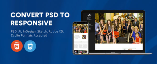
File Formats We Accept
File Formats We Accept
We work with a wide range of design file formats including:
- Photoshop (PSD)
- Adobe Illustrator
- InDesign
- Sketch App
- Zeplin (zeplin.io)
- InVisionApp
- Adobe XD
Send us your design in any of these formats, and we’ll handle the rest.
Turnaround Time
We deliver pixel-perfect, W3C valid, semantic, and SEO-optimized responsive HTML5/CSS3 code in as little as 4 to 24 hours, depending on project size and complexity.
Our Responsive Conversion Services
Here’s what we offer:
- PSD to Responsive HTML5 Conversion
- Sketch to Responsive HTML5 Conversion
- Adobe XD to Responsive HTML5 Conversion
- PSD to Responsive WordPress
- Sketch to Responsive WordPress
- XD to Responsive WordPress
- XD to WooCommerce
All our code is hand-coded, tested across devices and browsers, and optimized for performance.
Get Started with XHTMLTEAM
Ready to convert your PSD to responsive HTML5 or WordPress? Let XHTMLTEAM turn your design into a beautiful, high-performance, mobile-friendly website that works everywhere.
Visit XHTMLTEAM.com and get a Free Estimation or start your conversion today!
Keywords: PSD to Responsive HTML5, Sketch to Responsive HTML, Adobe XD to Responsive HTML, Responsive Web Design, PSD to Responsive WordPress, Mobile-Friendly Website Conversion, Responsive Coding Services, HTML5 CSS3 Responsive Layout, PSD to WooCommerce, SEO-Friendly HTML5, Cross-Device Compatibility.