

Canva is a powerful tool for creating visually appealing graphics, and it’s often used for designing email templates. However, to ensure your design is fully functional across different email clients and devices, you’ll need to convert the Canva design into HTML. In this guide, we’ll walk you through the process of converting a Canva design into a responsive HTML email, ensuring that it looks great on both desktop and mobile platforms.
1. Exporting Your Canva Design
Before you begin the conversion, you need to export your design from Canva. Here’s how to do it:
- Step 1: Open your Canva design and click the “Download” button in the top right corner.
- Step 2: Choose PNG for high-quality images or JPG for smaller file sizes.
- Step 3: Make sure to download the design in the appropriate dimensions for email. Typically, a width of 600px works well for most email clients.
2. Setting Up the Basic HTML Structure
Once you’ve exported the design, you can start creating the email template. The best practice for email design is to use inline CSS for styling, as this ensures the email will display properly across different email clients.
Here’s a simple HTML structure for your email:
<!DOCTYPE html>
<html lang="en">
<head>
  <meta charset="UTF-8">
  <meta name="viewport" content="width=device-width, initial-scale=1.0">
  <title>Responsive Email Template</title>
  <style>
    /* Add inline styles for the email */
  </style>
</head>
<body style="margin: 0; padding: 0; background-color: #f4f4f4;">

  <!-- Wrapper table -->
  <table role="presentation" width="100%" cellspacing="0" cellpadding="0" style="background-color: #f4f4f4; padding: 20px;">
    <tr>
      <td align="center">

        <!-- Main email content -->
        <table role="presentation" width="600" cellspacing="0" cellpadding="0" style="background-color: #ffffff; border-radius: 10px;">

          <!-- Header Image -->
          <tr>
            <td>
              <img src="path/to/your-canvas-image.jpg" alt="Email Header" width="600" style="max-width: 100%; height: auto; border-top-left-radius: 10px; border-top-right-radius: 10px;">
            </td>
          </tr>

          <!-- Body Content -->
          <tr>
            <td style="padding: 20px; font-family: Arial, sans-serif; font-size: 16px; text-align: center; color: #333;">
              <h1>Welcome to Our Newsletter</h1>
              <p>Thank you for subscribing! Stay tuned for exciting updates, offers, and news.</p>
            </td>
          </tr>

          <!-- Call to Action Button -->
          <tr>
            <td style="text-align: center; padding-bottom: 20px;">
              <a href="https://example.com" style="display: inline-block; background-color: #007BFF; color: white; padding: 15px 30px; text-decoration: none; border-radius: 5px; font-size: 18px;">Visit Our Website</a>
            </td>
          </tr>

        </table>
        <!-- End of Main content -->

      </td>
    </tr>
  </table>
  <!-- End of Wrapper -->

</body>
</html>
3. Using Inline CSS for Styling
When designing emails, inline CSS is crucial for compatibility, as many email clients (like Outlook and Gmail) do not support external or internal CSS stylesheets.
Here’s an example of inline CSS for the email body:
<td style="padding: 20px; font-family: Arial, sans-serif; font-size: 16px; text-align: center; color: #333;">
  <h1>Welcome to Our Newsletter</h1>
  <p>Thank you for subscribing! Stay tuned for exciting updates, offers, and news.</p>
</td>
This ensures that the text is styled correctly within the email.
4. Making the Email Template Responsive
Email clients, especially on mobile devices, require special attention to make sure your design adjusts based on screen size. We achieve this using media queries, which apply specific styles when the screen width is less than a certain threshold (like 600px, the typical width of mobile devices).
Here’s how you can apply a media query to adjust the layout for mobile devices:
<style>
  /* Mobile responsiveness */
  @media only screen and (max-width: 600px) {
    table {
      width: 100% !important;
    }
    img {
      width: 100% !important;
      height: auto !important;
    }
    h1 {
      font-size: 24px !important;
    }
    p {
      font-size: 14px !important;
    }
  }
</style>
This ensures that images and text scale appropriately on smaller screens.
5. Alt Text for Images
Images can be blocked by default in some email clients, so it’s important to include alt text for each image to ensure the content remains accessible.
<img src="path/to/your-canvas-image.jpg" alt="Welcome to Our Newsletter" width="600" style="max-width: 100%; height: auto; border-top-left-radius: 10px; border-top-right-radius: 10px;">
Alt text helps users understand the content of the image even when it’s not displayed.
6. Testing the Email Template
After coding the email template, it’s essential to test it across multiple email clients (e.g., Gmail, Outlook, Yahoo Mail) and devices (desktop, mobile) to ensure that it renders correctly.
Testing Tips:
- Use Tools: Tools like Litmus or Email on Acid allow you to test your email’s design across a variety of email clients and devices.
- Check Images: Ensure that images scale properly and that the email is readable without images enabled.
- Ensure Responsive Design: Make sure the email adapts well to smaller screens.
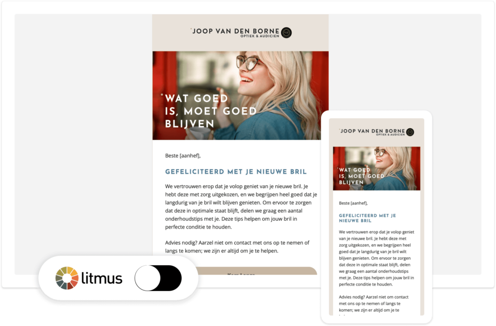
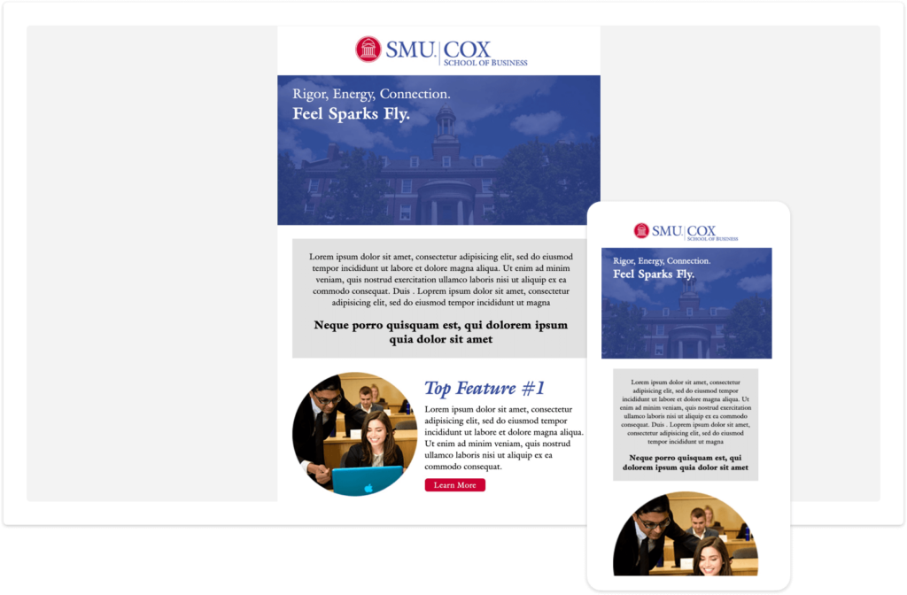
Work Sample:
7. Final Thoughts on Canva to Email Conversion
Creating a responsive email from a Canva design requires an understanding of HTML, CSS, and the limitations of email clients. By using inline styles, media queries, and testing extensively, you can ensure that your Canva design looks great across all devices.
Here’s a quick summary of the steps:
- Export your Canva design in high quality (PNG/JPG).
- Write your HTML structure using tables and inline CSS.
- Make the design responsive with media queries.
- Test your email template across multiple email clients.
- Add alt text to all images for better accessibility.
By following these steps, you can create a fully responsive, professional email template from a Canva design that works seamlessly across all email platforms.
This guide provides you with the essential steps and HTML code snippets required to convert your Canva designs into fully functional, responsive HTML email templates. It ensures that the design looks great on both desktop and mobile devices while complying with email client restrictions.